Mastering DAX (Data Analysis Expressions) calculations is fundamental to unlocking the full analytical power of Power BI semantic models. While basic visualizations can display your data, DAX formulas enable you to create sophisticated business metrics, time intelligence calculations, and complex analytical insights that drive real business decisions.
This lab will teach you to build calculated columns, measures, and calculated tables that transform raw data into meaningful KPIs, allowing you to perform advanced calculations like year-over-year growth, running totals, and dynamic filtering that would be impossible with standard aggregations alone. By the end of this lab, you’ll have the essential DAX skills needed to create professional-grade reports that provide actionable business intelligence and support data-driven decision making across your organization.
Create the Salesperson calculated table
In this task, you’ll create the Salesperson calculated table (that will have a direct relationship to the Sales table).
A calculated table is created by first entering the table name, followed by the equals symbol (=), followed by a DAX formula that returns a table. The table name can’t already exist in the data model.
You enter a valid DAX formula in the formula bar. The formula bar includes features like auto-complete, Intellisense and color-coding, which allow you to quickly and accurately enter the formula.
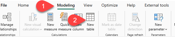
- In Power BI Desktop, in Report view, on the Modeling ribbon, from inside the Calculations group, select New Table.
- In the formula bar (which opens directly beneath the ribbon when you create or edit calculations), type
Salesperson =, press Shift+Enter, type'Salesperson (Performance)', and then press Enter.
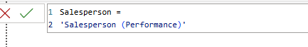
This table definition creates a copy of the Salesperson (Performance) table. It copies the data only; however, model properties like visibility, formatting, and others aren’t copied
In the Data pane, notice that the icon for the new table has an additional calculator in front of it (labeling a calculated table).
Note: Calculated tables are defined by using a DAX formula that returns a table. It’s important to understand that calculated tables increase the size of the data model because they materialize and store values. Also, they’re recomputed whenever formula dependencies are refreshed, as will be the case for this data model when new (future) date values are loaded into tables.
Unlike Power Query-sourced tables, calculated tables can’t be used to load data from external data sources. They can only transform data based on what has already been loaded into the data model.
- Switch to Model view, and notice that the
Salespersontable is available. - Create a relationship from the
Salesperson | EmployeeKeycolumn to theSales | EmployeeKeycolumn. The labs use a shorthand notation to reference a field. It will look like this:Salesperson | EmployeeKey. In this example,Salespersonis the table name andEmployeeKeyis the column name. - Right-click the inactive relationship (dotted line) between the
Salesperson (Performance)andSalestables, and then select Delete. When prompted to confirm the deletion, select Yes. - In the
Salespersontable, multi-select the following columns, and then hide them (set the Is Hidden property to Yes):EmployeeIDEmployeeKeyUPN
- In the model diagram, select the
Salespersontable. - In the Properties pane, in the Description box, enter: Salesperson related to sales.
- You may recall that descriptions appear as tooltips in the Data pane whenever the user hovers their cursor over a table or field.
- For the
Salesperson (Performance)table, set the description to: Salesperson related to region(s)
The data model now provides two alternatives when analyzing salespeople. The
Salespersontable allows analyzing sales made by a salesperson, while theSalesperson (Performance)table allows analyzing sales made in the sales region(s) assigned to the salesperson.
Create the Date table
In this task, you’ll create the Date table.
- Switch to Table view. On the Home ribbon tab, from inside the Calculations group, select New Table.
- In the formula bar, enter the following DAX:
Date =
CALENDARAUTO(6)
The CALENDARAUTO function returns a single-column table comprising date values. The “auto” behavior scans all data model date columns to determine the earliest and latest date values stored in the data model. It then creates one row for each date within this range, extending the range in either direction to ensure full years of data is stored.
This function can take a single optional argument that is the last month number of a year. When omitted, the value is 12, meaning that December is the last month of the year. In this case, 6 is entered, meaning that June is the last month of the year.
Notice the column of date values, which might be formatted using US regional settings (that is, mm/dd/yyyy).
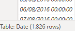
At the bottom-left corner, in the status bar, notice the table statistics, confirming that 1826 rows of data have been generated, which represents five full years’ data.
Create calculated columns
In this task, you’ll add more columns to enable filtering and grouping by different time periods. You’ll also create a calculated column to control the sort order of other columns.
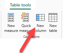
- On the Table Tools contextual ribbon, from inside the Calculations group, select New Column.
- A calculated column is created by first entering the column name, followed by the equals symbol (=), followed by a DAX formula that returns a single-value result. The column name can’t already exist in the table.
- In the formula bar, type the following and then press Enter:
Year =
"FY" & YEAR('Date'[Date]) + IF(MONTH('Date'[Date]) > 6, 1)
The formula uses the date’s year value but adds one to the year value when the month is after June. That’s how fiscal years at Adventure Works are calculated.
- In the formula bar, type the following and then press Enter:
Quarter =
'Date'[Year] & " Q"
    & IF(
        MONTH('Date'[Date]) <= 3,
        3,
        IF(
            MONTH('Date'[Date]) <= 6,
            4,
            IF(
                MONTH('Date'[Date]) <= 9,
                1,
                2
            )
        )
    )
- In the formula bar, type the following and then press Enter:
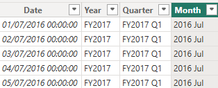
Month =
FORMAT('Date'[Date], "yyyy MMM")
- Verify the new columns have been added.
- To validate the calculations, switch to Report view.
- To add a matrix visual to the new report page, in the Visualizations pane, select the matrix visual type.
- In the Data pane, from inside the
Datetable, drag theYearfield into the Rows box. - Drag the
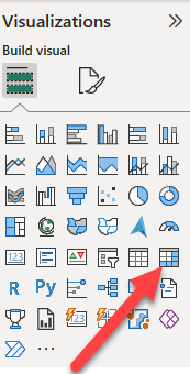
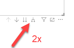
Monthfield into the Rows well, directly beneath theYearfield. - At the top-right of the matrix visual (or bottom, depending on the location of the visual), select the forked-double arrow icon (which will expand all years down one level).
Notice that the years expand to months, and that the months are sorted alphabetically rather than chronologically. By default, text values sort alphabetically, numbers sort from smallest to largest, and dates sort from earliest to latest.
- To customize the
Monthfield sort order, switch to Table view. - Add the
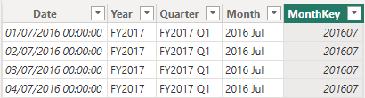
MonthKeycolumn to theDatetable.
MonthKey =
(YEAR('Date'[Date]) * 100) + MONTH('Date'[Date])
- This formula computes a numeric value for each year/month combination.
- In Table view, verify that the new column contains numeric values (for example, 201607 for July 2016, and so on).
- Switch back to Report view.
- In the Data pane, select the
Monthfield. - On the Column Tools contextual ribbon, from inside the Sort group, select Sort by Column, and then select MonthKey.
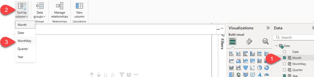
In the matrix visual, notice that the months are now chronologically sorted.
Complete the Date table
In this task, you’ll complete the design of the Date table by hiding a column and creating a hierarchy. You’ll then create relationships to the Sales and Targets tables.
- Switch to Model view.
- In the
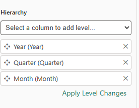
Datetable, hide theMonthKeycolumn (set Is Hidden to Yes). - In the Data pane, select the
Datetable, right-click theYearcolumn, and select Create hierarchy. - In the Properties pane, in the Name box, replace the value with Fiscal.
- Two add levels to the hierarchy, in the Hierarchy dropdown list, select Quarter and then select Month, and then select Apply Level Changes.
- Create the following two model relationships:
Date | DatetoSales | OrderDateDate | DatetoTargets | TargetMonth
- Hide the following two columns:
Sales | OrderDateTargets | TargetMonth
Mark the Date table
In this task, you’ll mark the Date table as a date table.
- Switch to Report view.
- In the Data pane, select the
Datetable (not theDatefield). - On the Table Tools contextual ribbon, from inside the Calendars group, select Mark as Date Table.
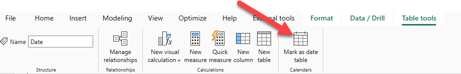
- In the Mark as a Date Table window, slide the Mark as a Date Table property to Yes.
- In the Choose a date column dropdown list, select Date.

Power BI Desktop now understands that this table defines date (time).
This design approach for a date table is suitable when you don’t have a date table in your data source. If you have a data warehouse, it would be appropriate to load date data from its date dimension table rather than “redefining” date logic in your data model.
Create simple measures
In this task, you’ll create simple measures. Simple measures aggregate values in a single column or count rows of a table.
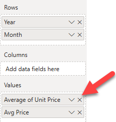
- In Report view, from the Data pane, drag the
Sales | Unit Pricefield into the matrix visual.
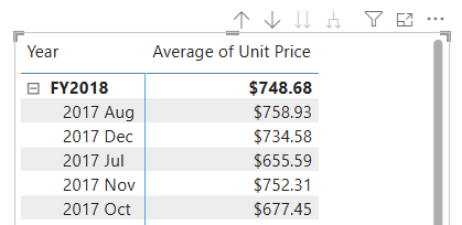
- In the visual fields pane (located in the Visualizations pane), in the Values box, notice that
Unit Pricefield is configured as Average of Unit Price.
- Select the down-arrow for Average of Unit Price, and then notice the available menu options.
- Visible numeric columns allow report authors at report design time to decide how column values will summarize (or not). However, it can result in inappropriate reporting. Some data modelers prefer not to leave things to chance, so they opt to hide these columns and instead expose aggregation logic defined in measures. It’s the approach you’ll now take in this lab.
- To create a measure, in the Data pane, right-click the
Salestable, and then select New Measure. - In the formula bar, add the following measure definition:
Avg Price =
AVERAGE(Sales[Unit Price])
- Add the
Avg Pricemeasure to the matrix visual, and notice that it produces the same result as theUnit Pricecolumn (but with different formatting). - In the Values box, open the context menu for the
Avg Pricefield, and notice that it isn’t possible to change the aggregation technique.- It’s not possible to modify the aggregation behavior of a measure.
- Create the following 5 measures in the Sales table:
Median Price =
MEDIAN(Sales[Unit Price])
Min Price =
MIN(Sales[Unit Price])
Max Price =
MAX(Sales[Unit Price])
Orders =
DISTINCTCOUNT(Sales[SalesOrderNumber])
Order Lines =
COUNTROWS(Sales)
The DISTINCTCOUNT function used in the Orders measure counts orders only once (ignoring duplicates). The COUNTROWS function used in the Order Lines measure operates over a table.
In this case, the number of orders is calculated by counting the distinct SalesOrderNumber column values, while the number of order lines is simply the number of table rows (each row is a line of an order).
- Switch to Model view, and then multi-select the four price measures:
Avg Price,Max Price,Median Price, andMin Price. - For the multi-selection of measures, configure the following requirements:
- Set the format to two decimal places.
- Assign to a display folder named Pricing (use the Display folder property in the Properties pane).
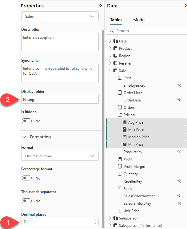
- Hide the
Unit Pricecolumn.- The
Unit Pricecolumn is no longer available to report authors. They must use the pricing measures you’ve added to the model. This design approach ensures that report authors won’t inappropriately aggregate prices, for example, by summing them.
- The
- Multi-select the
Order LinesandOrdersmeasures, and then configure the following requirements:- Set the format use the thousands separator.
- Assign to a display folder named Counts.
- In Report view, in the Values box of the matrix visual, for Average of Unit Price, select X to remove it.
- Increase the size of the matrix visual to fill the page width and height.
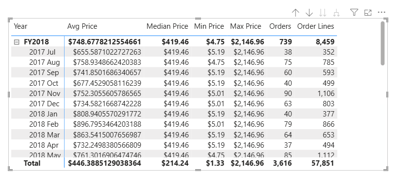
- Add the following five measures to the matrix visual:
Median PriceMin PriceMax PriceOrdersOrder Lines
- Verify that the results look sensible and are correctly formatted.
Create additional measures
In this task, you’ll create more measures that use more complex formulas.
- In Report view, click on the “+” sign next to Page 1 to create a new report page.
- Create a table visual that will include Salesperson (Performance) | Salesperson, Sales | Sales, and Targets | Target values
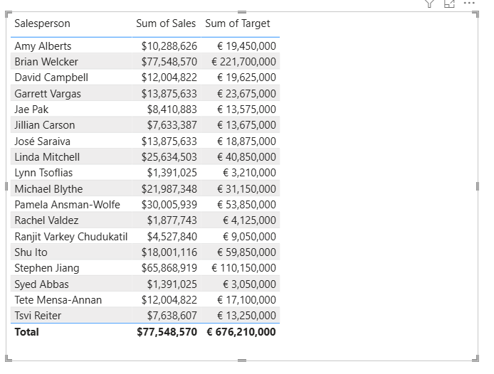
- Notice the total for the Sum of Target column (676,210,000)
- Select the table visual, and then in the Visualizations pane, remove Sum of Target.
- Rename the
Targets | Targetcolumn as TargetAmount.
- Create the following measure on the
Targetstable:
Target =
IF(
    HASONEVALUE('Salesperson (Performance)'[Salesperson]),
    SUM(Targets[TargetAmount])
)
The HASONEVALUE function tests whether a single value in the Salesperson column is filtered. When true, the expression returns the sum of target amounts (for just that salesperson). When false, BLANK is returned.
- Format the
Targetmeasure to zero decimal places.- Tip: You can use the Measure Tools contextual ribbon.
- Hide the
TargetAmountcolumn.Tip: You can right-click the column in the Data pane, and then select Hide. - Notice that the
Targetstable now appears at the top of the list.
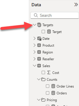
Tables that comprise only visible measures are automatically listed at the top of the list.
- Add the
Targetmeasure to the table visual.
Notice that the Target column total is now BLANK.
- Create the following two measures for the
Targetstable:
Variance =
IF(
	HASONEVALUE('Salesperson (Performance)'[Salesperson]),
	SUM(Sales[Sales]) - [Target]
)
Variance Margin =
DIVIDE([Variance], [Target])
- Format the
Variancemeasure for zero decimal places. - Format the
Variance Marginmeasure as percentage with two decimal places. - Add the
VarianceandVariance Marginmeasures to the table visual. - Resize the table visual so all columns and rows can be seen.
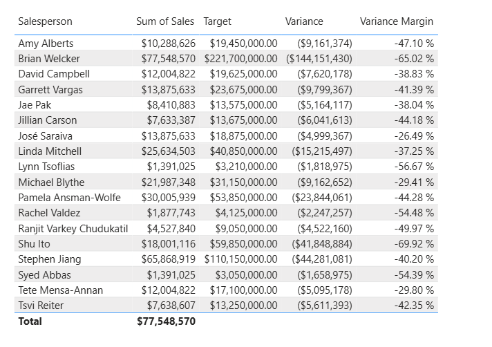
While it appears all salespeople aren’t meeting target, remember that the table visual isn’t yet filtered by a specific time period. You’ll produce sales performance reports that filter by a user-selected time period in one of the following labs.
Modify DAX filter context in Power BI
In this section, you’ll learn how to use CALCULATE function to manipulate filter context.
- In Power BI Desktop, create a new report page.
- On Page 3, add a matrix visual.
- Resize the matrix visual to fill the entire page.
- To configure the matrix visual fields, from the Data pane, drag the
Region | Regionshierarchy, and drop it inside the visual. - Add the
Sales | Salesfield to the Values box. - To expand the entire hierarchy, at the top-right of the matrix visual, select the forked-double arrow icon twice.
- To format the visual, in the Visualizations pane, select the Format pane.
- In the Search box, enter Layout.
- Set the Layout property to Tabular.
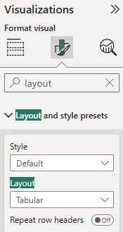
- Verify that the matrix visual now has 4 column headers.
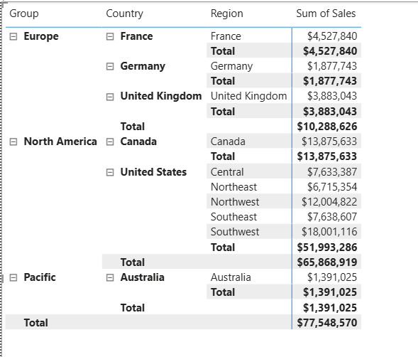
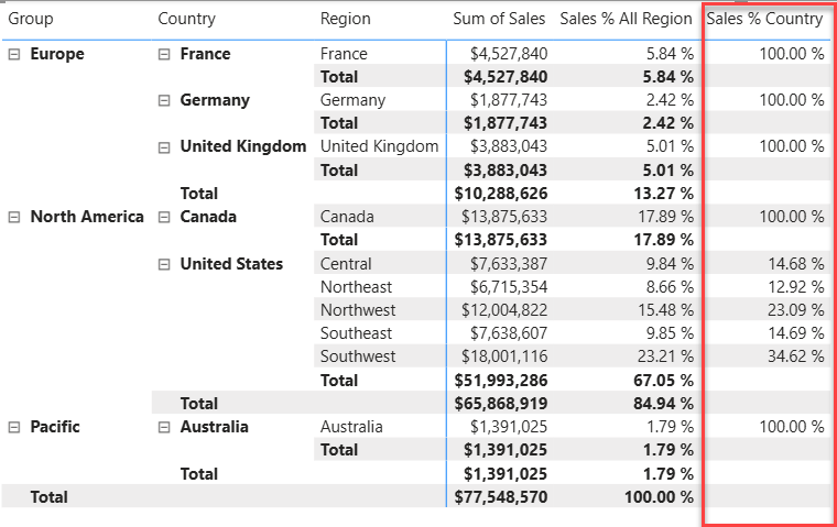
At Adventure Works, the sales regions are organized into groups, countries, and regions. All countries – except the United States – have just one region, which is named after the country. As the United States is such a large sales territory, it’s divided into five sales regions.
You’ll create various measures in this exercise, and then test them by adding them to the matrix visual.
Manipulate filter context
In this task, you’ll create several measures with DAX expressions that use the CALCULATE function to manipulate filter context.
The
CALCULATEfunction is a powerful function you can use to manipulate the filter context. The first argument takes an expression or a measure (a measure is just a named expression). Subsequent arguments allow modifying the filter context.
- Add a measure to the
Salestable, based on the following expression:
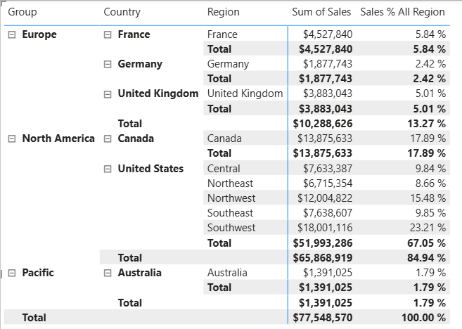
Sales All Region =
CALCULATE(
    SUM(Sales[Sales]),
    REMOVEFILTERS(Region)
)
The REMOVEFILTERS function removes active filters. It can take either no arguments, or a table, a column, or multiple columns as its argument.
In this formula, the measure evaluates the sum of the Sales column in a modified filter context, which removes any filters applied to the columns of the Region table.
- Add the
Sales All Regionmeasure to the matrix visual.
- Notice that the measure computes the total of all region sales for each region, country (subtotal) and group (subtotal).
- The new measure is yet to deliver a useful result. When the sales for a group, country, or region are divided by this value, it will produce a useful ratio known as “percent of grand total”.
- In the Data pane, ensure that the
Sales All Regionmeasure is selected (when selected, it will have a dark gray background), and then in the formula bar, replace the measure name and formula with the following formula:- Tip: To replace the existing formula, first copy the snippet. Then, select inside the formula bar and press Ctrl+A to select all text. Then, press Ctrl+V to paste the snippet to overwrite the selected text. Then press Enter.
Sales % All Region =
DIVIDE(
    SUM(Sales[Sales]),
    CALCULATE(
        SUM(Sales[Sales]),
        REMOVEFILTERS(Region)
    )
)
The measure has been renamed to accurately reflect the updated formula. The DIVIDE function divides the sum of the Sales column (not modified by filter context) by the sum of the Sales column in a modified context, which removes any filters applied to the Region table.
In the matrix visual, notice that the measure has been renamed and that a different value now appears for each group, country, and region.
- Format the
Sales % All Regionmeasure as a percentage with two decimal places. - In the matrix visual, review the
Sales % All Regionmeasure values.
- Add another measure to the
Salestable, based on the following expression, and format as a percentage:
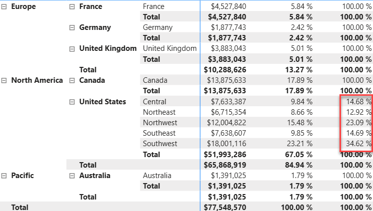
Sales % Country =
DIVIDE(
    SUM(Sales[Sales]),
    CALCULATE(
        SUM(Sales[Sales]),
        REMOVEFILTERS(Region[Region])
    )
)
Notice that the Sales % Country measure formula differs slightly from the Sales % All Region measure formula. The difference is that the denominator modifies the filter context by removing filters on the Region column of the Region table, not all columns of the Region table. That means that any filters applied to the group or country columns are preserved. It will achieve a result that represents the sales as a percentage of the country.
- Add the
Sales % Countrymeasure to the matrix visual.
Notice that only the regions of the United States produce a value that isn’t 100 percent.
- To improve the readability of this measure in visual, overwrite the
Sales % Countrymeasure with the following improved formula.
Sales % Country =
IF(
    ISINSCOPE(Region[Region]),
    DIVIDE(
        SUM(Sales[Sales]),
        CALCULATE(
            SUM(Sales[Sales]),
            REMOVEFILTERS(Region[Region])
        )
    )
)
The IF function uses the ISINSCOPE function to test whether the region column is the level in a hierarchy of levels. When true, the DIVIDE function is evaluated. When false, BLANK is returned because the region column isn’t in scope.
- Notice that the
Sales % Countrymeasure now only returns a value when a region is in scope.
- Add another measure to the
Salestable, based on the following expression, and format as a percentage:
Sales % Group =
DIVIDE(
    SUM(Sales[Sales]),
    CALCULATE(
        SUM(Sales[Sales]),
        REMOVEFILTERS(
            Region[Region],
            Region[Country]
        )
    )
)
- Add the
Sales % Groupmeasure to the matrix visual. - To improve the readability of this measure in visual, overwrite the
Sales % Groupmeasure with the following formula.
Sales % Group =
IF(
    ISINSCOPE(Region[Region])
        || ISINSCOPE(Region[Country]),
    DIVIDE(
        SUM(Sales[Sales]),
        CALCULATE(
            SUM(Sales[Sales]),
            REMOVEFILTERS(
                Region[Region],
                Region[Country]
            )
        )
    )
)
- Notice that the
Sales % Groupmeasure now only returns a value when a region or country is in scope. - In Model view, place the three new measures into a display folder named Ratios.
Use DAX time intelligence functions in Power BI
In this section, you’ll create measures with DAX expressions that involve time intelligence.
Create a YTD measure
- In Power BI Desktop, in Report view, on Page 1, notice the matrix visual that displays various measures with years and months grouped on the rows.
- Add a measure to the
Salestable, based on the following expression, and formatted to zero decimal places:
Sales YTD =
TOTALYTD(
    SUM(Sales[Sales]),
    'Date'[Date],
    "6-30"
)
The TOTALYTD function evaluates an expression – in this case the sum of the Sales column – over a given date column. The date column must belong to a date table marked as a date table.
The function can also take a third optional argument representing the last date of a year. The absence of this date means that December 31 is the last date of the year. For Adventure Works, June is in the last month of their year, and so “6-30” is used.
- Add the
Salesfield and theSales YTDmeasure to the matrix visual. - Notice the accumulation of sales values within the year.
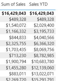
The TOTALYTD function performs filter manipulation, specifically time filter manipulation. For example, to compute YTD sales for September 2017 (the third month of the fiscal year), all filters on the Date table are removed and replaced with a new filter of dates commencing at the beginning of the year (July 1, 2017) and extending through to the last date of the in-context date period (September 30, 2017).
Create a YoY growth measure
In this task, you’ll create a sales YoY growth measure by using a variable.
Variables help you simplify the formula and are more efficient if using the logic multiple times within a formula. Variables are declared with a unique name, and the measure expression must then be output after the
RETURNkeyword. Unlike some other coding language variables, DAX variables can only be used within the single formula.
- Add another measure to the
Salestable, based on the following expression:
Sales YoY Growth =
VAR SalesPriorYear =
    CALCULATE(
        SUM(Sales[Sales]),
        PARALLELPERIOD(
            'Date'[Date],
            -12,
            MONTH
        )
    )
RETURN
    SalesPriorYear
The SalesPriorYear variable is assigned an expression that calculates the sum of the Sales column in a modified context. That context uses the PARALLELPERIOD function to shift 12 months back from each date in filter context.
- Add the
Sales YoY Growthmeasure to the matrix visual. - Notice that the new measure returns
BLANKfor the first 12 months (because there were no sales recorded before fiscal year 2017). - Notice that the
Sales YoY Growthmeasure value for 2018 Jul is the sales value for 2017 Jul.
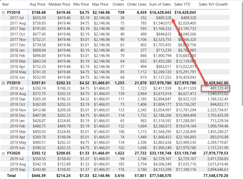
Now that the “difficult part” of the formula has been tested, you can overwrite the measure with the final formula that computes the growth result.
- To complete the measure, overwrite the
Sales YoY Growthmeasure with this formula, formatting it as a percentage with two decimal places:
Sales YoY Growth =
VAR SalesPriorYear =
    CALCULATE(
        SUM(Sales[Sales]),
        PARALLELPERIOD(
            'Date'[Date],
            -12,
            MONTH
        )
    )
RETURN
    DIVIDE(
        (SUM(Sales[Sales]) - SalesPriorYear),
        SalesPriorYear
    )
- In the formula, in the
RETURNclause, notice that the variable is referenced twice. - Verify that the YoY growth for 2018 Jul is 392.83%.
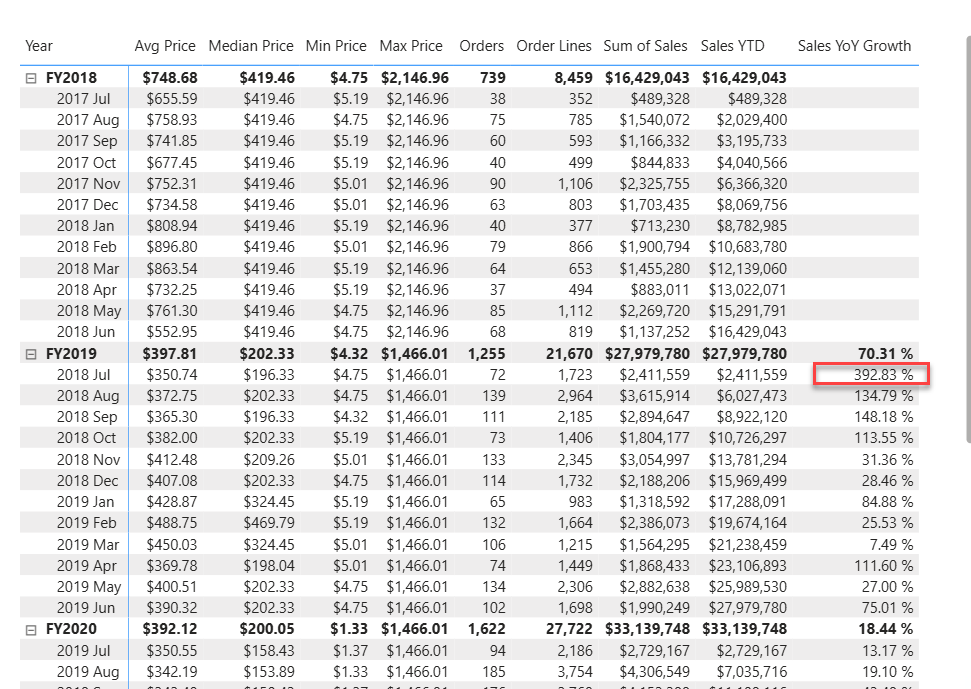
The YoY growth measure identifies almost 400 percent (or 4x) increase of sales during the same period of the previous year.
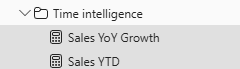
- In Model view, place the two new measures into a display folder named Time intelligence.
- Save the Power BI Desktop file.
Amazing work! You’ve just learned how to leverage DAX language to enhance the data model. See you in the next lab!