Effective report design is the critical bridge between raw data and actionable business insights, transforming complex datasets into compelling visual narratives that drive informed decision-making.
This lab focuses on the essential principles of creating professional, user-friendly Power BI reports that not only look polished but also communicate data stories clearly and efficiently. You’ll learn to apply visual hierarchy, choose appropriate chart types, and implement consistent filtering and formatting. By mastering these design fundamentals, you’ll create reports that stakeholders actually want to use!
Let’s kick it off!
Design page 1
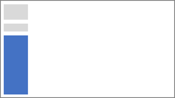
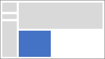
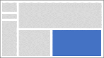
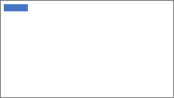
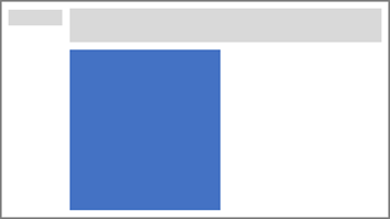
In this task, you’ll design the first report page. When you’ve completed the design, the page will look similar to the following:
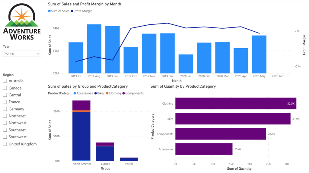
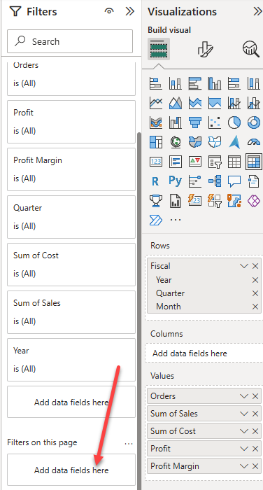
- In Power BI Desktop, to rename the page, at the bottom-left, right-click Page 1, then select Rename. Rename the page as Overview.
- Tip: You can also double-click the page name to rename it.
- To add an image, on the Insert ribbon tab, from inside the Elements group, select Image.

- In the Open window, navigate to the folder where you extracted the source data files.
- Select the AdventureWorksLogo.jpg file, and then select Open.
- Drag the image to position it at the top-left corner, and also drag the guide markers to resize it.
- To add a slicer, first unselect the image by selecting an empty area of the report page, then select Slicer in the Visualizations pane.
- In the Data pane, drag the
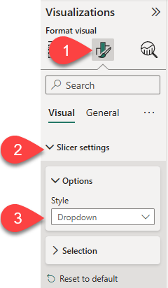
Date | Yearfield (not theYearlevel of the hierarchy) into the slicer Field well in the Visualizations pane. - To convert the slicer from a list to a dropdown, in the Visualizations pane, select Format visual. Expand Slicer settings, and then set the Style dropdown to Dropdown.
- Resize and position the slicer so it sits beneath the image and is the same width as the image.
- In the Year slicer, open the dropdown list, select FY2020, and then collapse the dropdown list.
The report page is now filtered by year FY2020.
- Unselect the slicer by selecting an empty area of the report page.
- Create a second slicer, based on the
Region | Regionfield (not theRegionlevel of the hierarchy). - Leave the slicer as a list, and then resize and position the slicer beneath the Year slicer.
- Unselect the slicer by selecting an empty area of the report page.
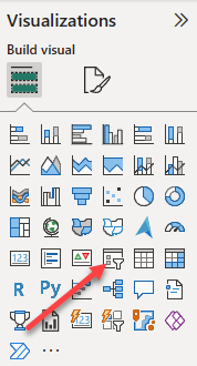
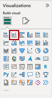
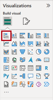
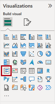
- To add a chart to the page, in the Visualizations pane, select the Line and Stacked Column Chart visual type.
- Resize and position the visual so it sits to the right of the logo, and so it fills the width of the report page.
- Drag and drop the following fields into the visual:
Date | MonthSales | Sales
- In the visual fields pane (located in the Visualizations pane), notice that the fields are assigned to the X-axis and Column y-axis wells.
- By dragging fields into a visual, they’re added to the default boxes. For precision, you can drag fields directly into the wells, as you’ll do next.
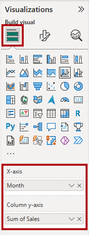
- From the Data pane, drag the
Sales | Profit Marginfield into the Line y-axis well.
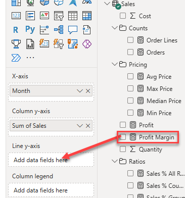
- Notice that the visual only has 11 months.
- The last month of the year, 2020 June, doesn’t have any sales yet. By default, the visual has eliminated months with
BLANKsales. You’ll now configure the visual to show all months.
- The last month of the year, 2020 June, doesn’t have any sales yet. By default, the visual has eliminated months with
- In the visual fields pane, in the X-axis well, for the Month field, select the down-arrow, and then select Show items with no data.
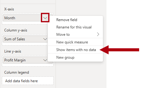
Notice that the month 2020 June now appears.
- Unselect the chart by selecting an empty area of the report page.
- To add a chart to the page, in the Visualizations pane, select the Stacked Column Chart visual type.
- Resize and position the visual so it sits beneath the column/line chart, and so it fills half the width of the chart above.
- Add the following fields to the visual boxes:
- X-axis:
Region | Group - Y-axis:
Sales | Sales - Legend:
Product | ProductCategory
- X-axis:
- Unselect the chart by selecting an empty area of the report page.
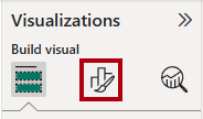
- To add a chart to the page, in the Visualizations pane, select the Stacked Bar Chart visual type.
- Resize and position the visual so it fills the remaining report page space.
- Add the following fields to the visual wells:
- Y-axis:
Product | ProductCategory - X-axis:
Sales | Quantity
- Y-axis:
- To format the visual, open the Format pane.
- Expand the Bars section, and then in the Color group, set the Color property to a suitable color (to complement the column/line chart).
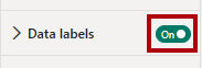
- Set the Data Labels section to On.
Great! The first page is now completed!
Design page 2
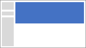
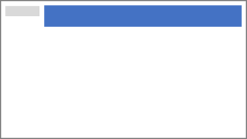
In this task, you’ll design the second report page. When you’ve completed the design, the page will look similar to the following:
- To create a new page, at the bottom-left, select the plus icon. When the page is added, rename it as Profit.
- Add a slicer based on the
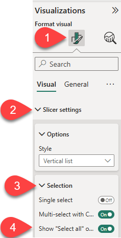
Region | Regionfield. - Use the Format pane to show the Select all option (located in the Slicer settings > Selection section).
- Resize and position the slicer so it sits at the left side of the report page, and so it’s about half the page height.

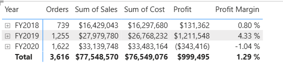
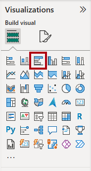
- Add a matrix visual, and resize and position it so it fills the remaining space of the report page

- Add the
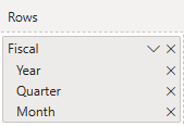
Date | Fiscalhierarchy to the matrix Rows box.
Add the following five Sales table fields to the Values well:
Orders(from theCountsfolder)SalesCostProfitProfit Margin
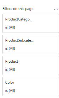
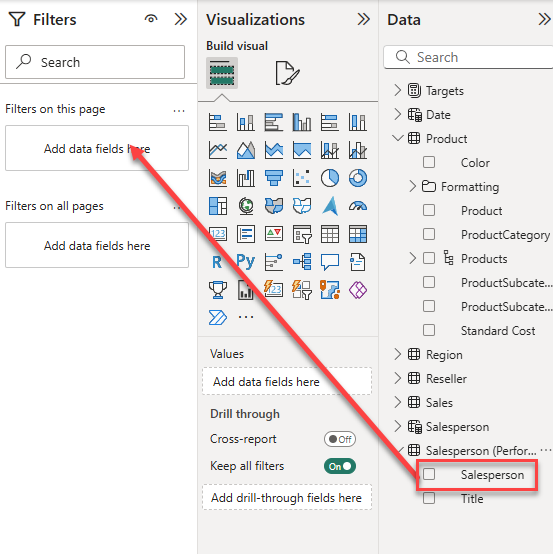
- In the Filters pane (located at the left of the Visualizations pane), notice the Filters on this page section (you may need to expand the pane and scroll down).
- From the Data pane, drag the
Product | ProductCategoryfield into the Filters on this page box.- Fields added to the Filters pane can achieve the same result as a slicer. One difference is that they don’t take up space on the report page. Another difference is that they can be configured to achieve more sophisticated filtering requirements.
- Inside the filter card, at the top right, select the arrow to collapse the card.
- Add each of the following
Producttable fields to the Filters on this page box, collapsing each, directly beneath theCategoryfield:- Product
Subcategory ProductColor
- Product
Awesome! Page 2 has just been completed!
Design page 3
In this task, you’ll design the third and final report page. When you’ve completed the design, the page will look similar to the following:
- Create a new page and rename it as My Performance.
- To simulate the performance of row-level security filters, drag the
Salesperson (Performance) | Salespersonfield to the page level filters in the filter pane.
- In the filter card, select Michael Blythe.
- Data on the report page will now be filtered to display data for Michael Blythe only.
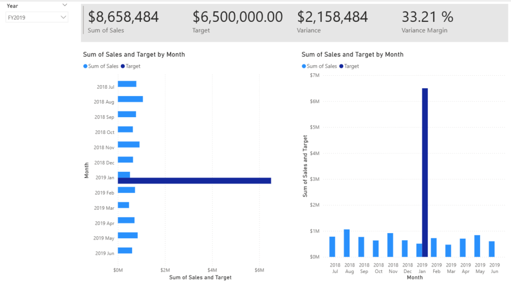
- Add a dropdown slicer based on the
Date | Yearfield, and then resize and position it so it sits at the top-left corner of the page.
- In the slicer, set the page to filter by FY2019.
- Add a Multi-row Card visual to the page, and then resize and reposition it so it sits to the right of the slicer and fills the remaining width of the page.
- Add the following four fields to the visual:
Sales | SalesTargets | TargetTargets | VarianceTargets | Variance Margin
- Format the visual:
- In the Callout values section, increase the font size property to 28pt.
- In the General tab, in the Effects section, set the background color property to a light gray color (such as White, 10% Darker) to provide contrast.

- Add a Clustered Bar Chart visual to the page, and then resize and position it so it sits beneath the multi-row card visual and fills the remaining height of the page, and half the width of the multi-row card visual.
Add the following fields to the visual boxes:
- Y-axis:
Date | Month - X-axis:
Sales | SalesandTargets | Target
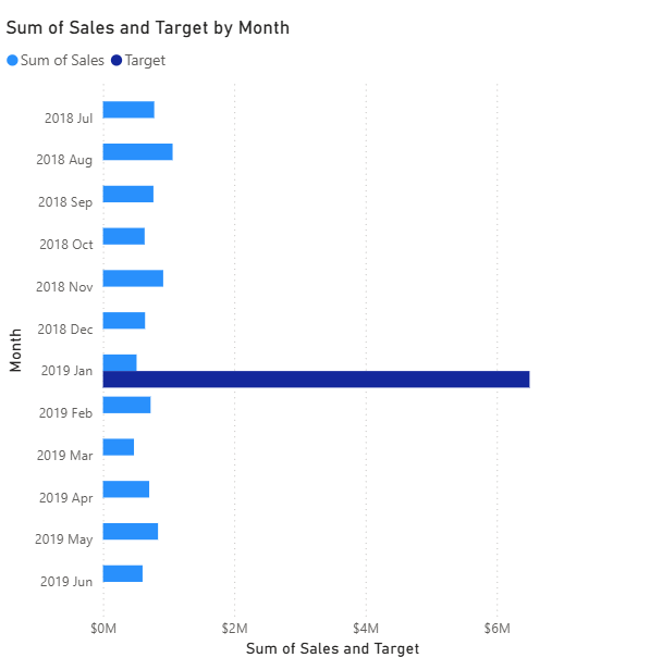
- To create a copy of the visual, press Ctrl+C, and then press Ctrl+V.
- Position the new visual to the right of the original visual.

- To modify the visualization type, in the Visualizations pane, select Clustered Column Chart.
It’s now possible to see the same data expressed by two different visualization types. The design of the final page is complete.
Sync slicers
In this task, you’ll sync the Year and Region slicers.
- On the Overview page, set the Year slicer to FY2018.
- Go to the My Performance page, and then notice that the Year slicer has a different value.
- When slicers aren’t synced, it can contribute to misrepresentation of data and frustration for report users. You’ll now sync the report slicers.
- Return to the Overview page, and then select the Year slicer.
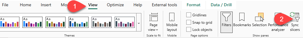
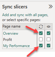
- On the View ribbon tab, from inside the Show Panes group, select Sync Slicers.
- In the Sync Slicers pane (at the left of the Visualizations pane), in the second column (which represents syncing), check the checkboxes for the Overview and My Performance pages.
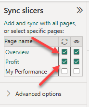
- On the Overview page, select the Region slicer.
- Sync the slicer with the Overview and Profit pages.
- Test the sync slicers by selecting different filter options, and then verifying that the synced slicers filter by the same selection.
- To close the Sync Slicer pane, select the Sync Slicer option located on the View ribbon tab.
A-M-A-Z-I-N-G! Congrats on designing your first Power BI report! Let’s now push our data visualization game to a whole new level in the next lab!